Flexbox, or the CSS Flexible Box Layout Module, is a powerful tool for web designers and developers. It allows you to create flexible and responsive layouts quickly and efficiently. In this guide, we'll explore the basics of Flexbox and how you can leverage its features to enhance your web design projects.
What is Flexbox?
CSS Flexbox is a layout model designed to make it easier to align and distribute space among elements in a container. It provides a straightforward way to create dynamic, adaptable layouts that work well across different screen sizes and devices.
Key Concepts
Before we dive into the details of Flexbox, let's review some key concepts:
-
Flex Container: The parent element that contains the flex items. It is defined by setting the
displayproperty toflexorinline-flex. - Flex Items: The child elements inside the flex container. These items can be positioned and sized using various flex properties.
-
Flex Direction: Determines the direction in which the flex items are laid out (row or column). The default direction is
row. - Main Axis: The primary axis of the flex container (row or column).
- Cross Axis: The axis perpendicular to the main axis.
Flexbox Properties
Flex Container Properties:
-
display: Sets the flex container type (
flexorinline-flex)..container { display: flex; } -
flex-direction: Specifies the direction of the main axis (
row,row-reverse,column,column-reverse)..container { flex-direction: row; } -
justify-content: Controls alignment along the main axis (
flex-start,flex-end,center,space-between,space-around,space-evenly)..container { justify-content: center; } -
align-items: Controls alignment along the cross axis (
flex-start,flex-end,center,baseline,stretch)..container { align-items: stretch; } -
align-content: Aligns multiple lines along the cross axis (when items wrap).
.container { align-content: flex-start; } -
flex-wrap: Controls whether flex items wrap onto multiple lines (
nowrap,wrap,wrap-reverse)..container { flex-wrap: wrap; }
Flex Item Properties:
-
flex-grow: Specifies how much a flex item should grow relative to the other items.
.item { flex-grow: 1; } -
flex-shrink: Specifies how much a flex item should shrink relative to the other items.
.item { flex-shrink: 1; } -
flex-basis: Defines the initial size of a flex item.
.item { flex-basis: 100px; } -
align-self: Overrides the container's
align-itemsproperty for an individual flex item..item { align-self: center; } -
order: Controls the order in which flex items appear within the flex container.
.item {
                                order: 1;
                            }
Flexbox in Action
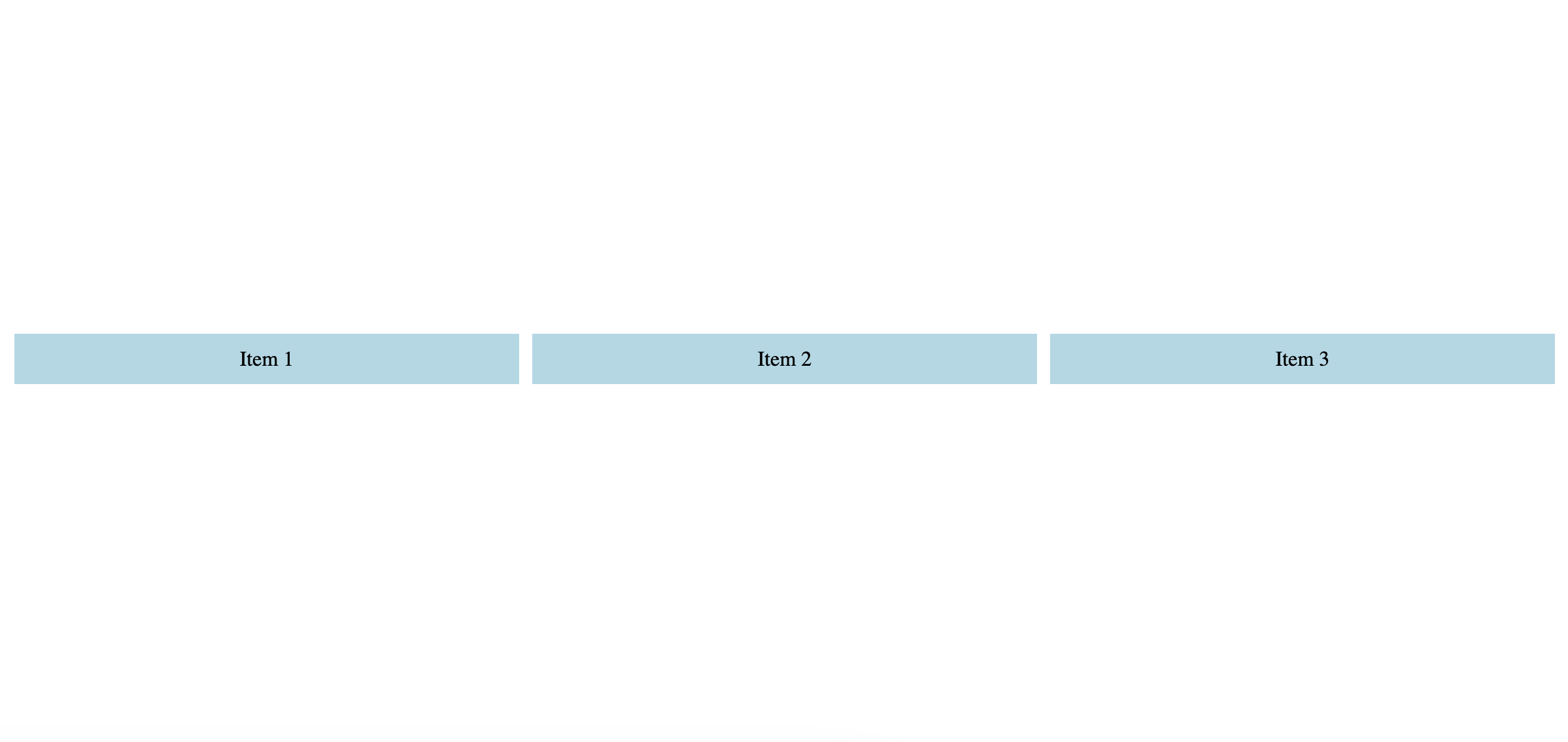
Let's look at a practical example of Flexbox in action:
<!DOCTYPE html>
                <html lang="en">
                <head>
                    <meta charset="UTF-8">
                    <meta http-equiv="X-UA-Compatible" content="IE=edge">
                    <meta name="viewport" content="width=device-width, initial-scale=1.0">
                    <title>Flexbox Example</title>
                    <style>
                        .container {
                            display: flex;
                            flex-direction: row;
                            justify-content: center;
                            align-items: center;
                            height: 100vh;
                        }
                        .item {
                            flex-grow: 1;
                            padding: 10px;
                            margin: 5px;
                            background-color: lightblue;
                            text-align: center;
                        }
                    </style>
                </head>
                <body>
                    <div class="container">
                        <div class="item">Item 1</div>
                        <div class="item">Item 2</div>
                        <div class="item">Item 3</div>
                    </div>
                </body>
                </html>
In this example, we create a flex container with three flex items. The container is set to display as a row, and the items are evenly spaced and aligned to the center of the container.
Conclusion
CSS Flexbox is a versatile layout tool that simplifies the creation of flexible, responsive designs. By understanding and applying the various properties available in Flexbox, you can create dynamic and visually appealing layouts with ease. Experiment with different Flexbox properties to see how they can enhance your web design projects. Happy coding!