Introduction
Drupal's CSS Grid Layout module provides a powerful tool for web developers to create flexible and responsive page layouts. By leveraging the CSS Grid system, developers can easily define grid-based layouts that adapt to different screen sizes and orientations, improving the overall user experience.
In this blog post, we will explore the benefits of using Drupal's CSS Grid Layout module and provide some examples of its usage in real-world scenarios.
Understanding CSS Grid Terminology
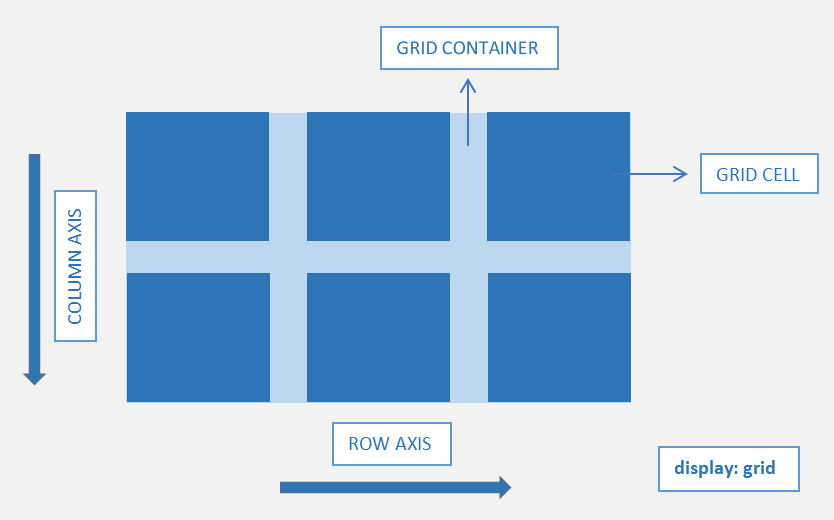
Similar to CSS Flexbox, which utilizes flex containers and flex items, CSS Grid follows a comparable paradigm with grid containers and grid items. we simply set its display property to "grid".
Grid Container: The grid container encompasses all the grid items within its defined area.
Grid Cell: Each individual item within the grid container is referred to as a grid cell or grid item. A Grid layout forms a two-dimensional structure, with columns along the Y-axis and rows along the X-axis.
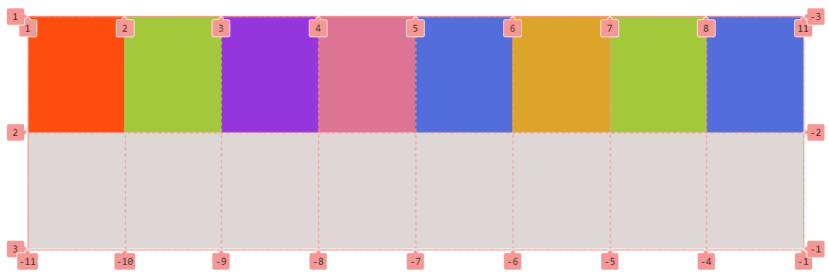
Grid Line: The vertical and horizontal lines that divide the grid into columns and rows are termed grid lines. They are automatically numbered for both columns and rows, starting from 1 and extending to the number of rows or columns plus 1.
Grid Gap: The space between grid cells is known as a gutter or Grid Gap.
Grid Track: Grid items aligned in a row or column are referred to as a grid track. For horizontal alignment, we use the term "row track," and for vertical alignment, it's called a "column track."
Grid Area: The area delimited by two vertical and horizontal lines is labeled as a grid area.
Demonstration of row and column values and properties
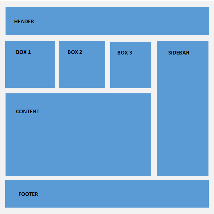
HTML Structure
<div class="wrapper">
  <div class="header">Header</div>
  <div class="box-1">Box 1</div>
  <div class="box-2">Box 2</div>
  <div class="box-3">Box 3</div>
  <div class="main-content">Main Content</div>
  <div class="sidebar">Sidebar</div>
  <div class="footer">Footer</div>
</div>
CSS Grid Styling
.wrapper{
  display: grid;
  grid-template-rows: 100px 200px 400px 100px;
  grid-template-columns: repeat(3, 1fr) minmax(200px, 1fr);
  grid-gap: 30px;

  /* Line names */
  grid-template-rows: 100px [box-start] 200px [box-end content-start] 400px [content-end] 100px;

  /* Grid area names */
  grid-template-areas: "head head head ."
                      "box1 box2 box3 side"
                      "main main main side"
                      "foot foot foot foot";
}

/* Using Line numbers */
.header{
  grid-column: 1 / -1;
}

.main-content{
  grid-row: 3 / 4;
  grid-column: 1 / 4;
}

/* Using Line Names */
.sidebar{
  grid-row: box-start / content-end;
}

/* Using Grid Area Names */
.footer{
  grid-column: foot;
}
Understanding Grid Properties
To create a grid layout, we start by declaring an element as a grid container using display: grid.
grid-template-rows - Defines the number of rows in the grid layout.
grid-template-columns - Defines the number of columns in the grid layout.
row-gap & column-gap - Specifies the gap between grid rows and columns individually.
grid-gap - Sets the gap between both rows and columns in the grid layout.
The Repeat function - Allows for a concise notation of a repetitive pattern for a substantial number of columns or rows within the grid.
The Fr unit - Represents a fractional unit that dynamically calculates layout divisions. With 1fr, an element gets one share of the available space within the grid.
Naming Grid Lines - Provides names to specific or all lines in the grid using the grid-template-rows and grid-template-columns properties.
Naming Grid Areas - Specifies named grid areas, assigning names to the cells in the grid layout using the grid-template-areas CSS property.
grid-row - Determines the start and end position of a grid item within the grid row.
grid-columns - Specifies the start and end position of a grid item within the grid column.
min-content - Specifies the intrinsic minimum width of the content.
max-content - Specifies the intrinsic maximum width or height of the content.
minmax - Establishes a size range greater than or equal to the minimum and less than or equal to the maximum content.
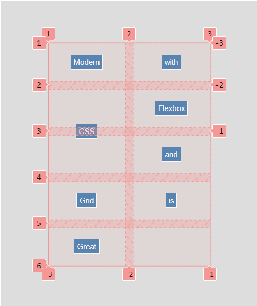
Browser inspector view for grid - align and justify items and content
align-items - Aligns Grid items inside the grid cell or area along the column/vertical axis.
justify-items - Aligns Grid items inside the grid cell or area along the row/horizontal axis.
align-self - Overrides the align-items value for a specific grid item, aligning it inside the cell/area along the column/vertical axis.
justify-self - Overrides the justify-items value for a specific grid item, aligning it inside the cell/area along the row/horizontal axis.
align-content - Defines how the grid content is distributed along the column axis/vertically in a grid container.
justify-content - Defines how the grid content is distributed along the row axis/horizontally in a grid container.
grid-auto-flow - Controls the direction in which auto-placed items are inserted into the grid, either in the row or column direction. The default value is row.
grid-auto-rows - Sets a size for the rows in a grid container when they are automatically generated.
grid-auto-columns - Sets a size for the columns in a grid container when they are automatically generated.
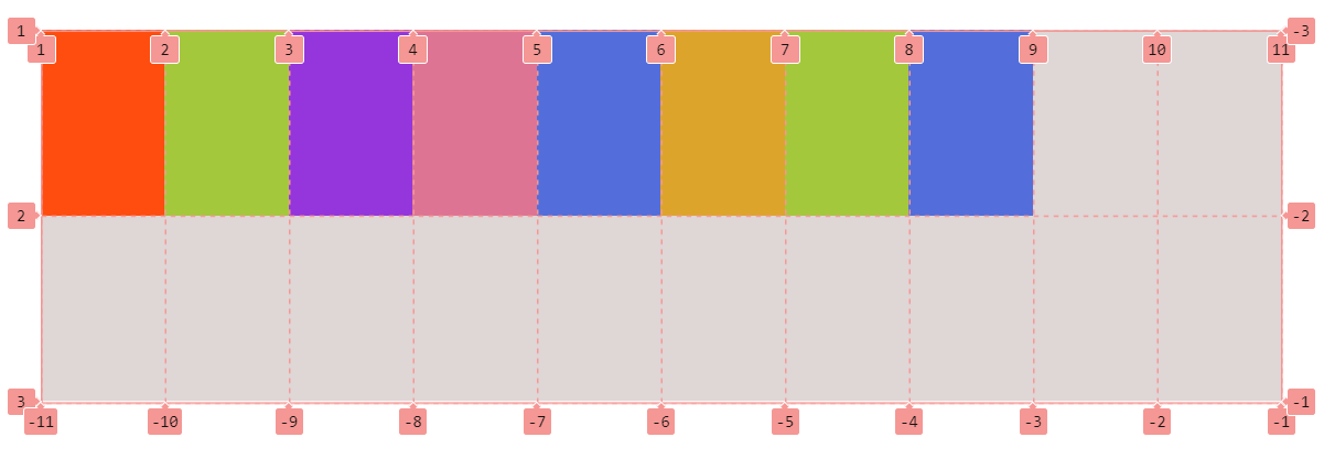
auto-fill - Fills rows with as many columns as possible, even if the added column is empty, occupying space in the row.
Browser inspector view for grid auto-fill property
auto-fit - Fills rows with as many columns as possible, collapsing empty cells by setting their width to 0 to prevent excess space.
Browser inspector view for the grid auto-fit property
Implementing the Drupal CSS Grid layout module
The Drupal CSS Grid Layout module seamlessly integrates the power of CSS Grid into your Drupal environment, providing a flexible and efficient way to structure and organize content.
Installing the module
Prerequisites:
- Layout builder
- Layout Discovery
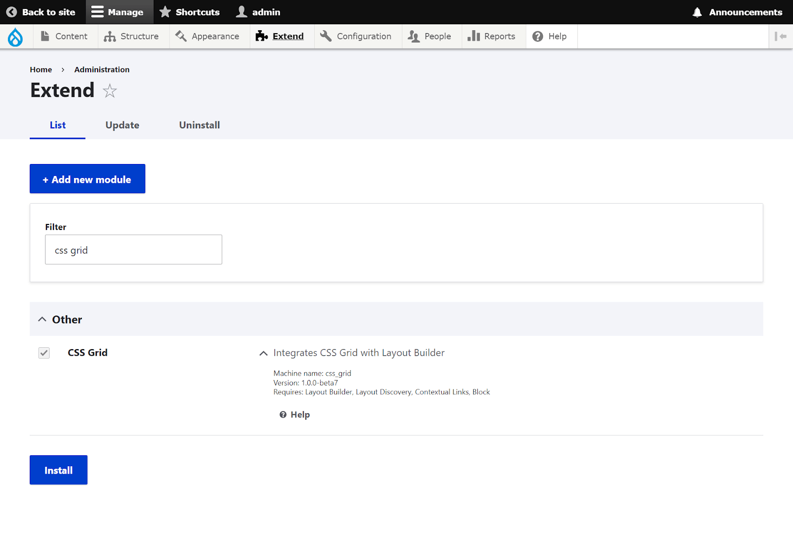
To install the CSS Grid Layout module, use the following Composer command:
composer require 'drupal/css_grid:^1.0@beta'Once installed, enable the module at Administration > Extend.
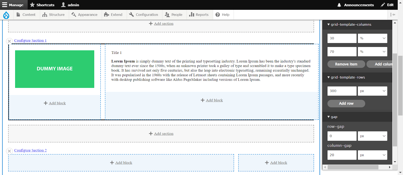
Create a new layout builder page:
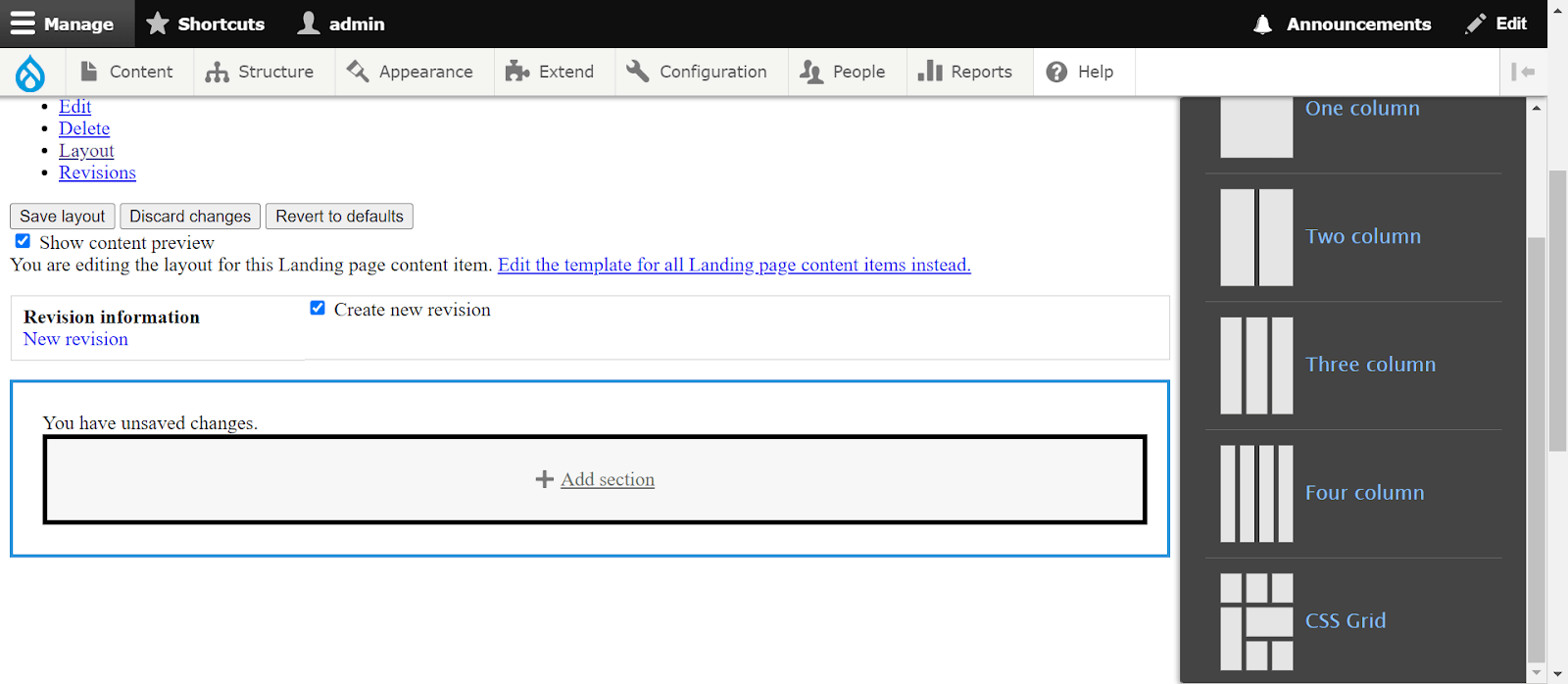
Content → Add content → Layout builder page → Layout → Add section
You will now have a newly created layout using CSS Grid.
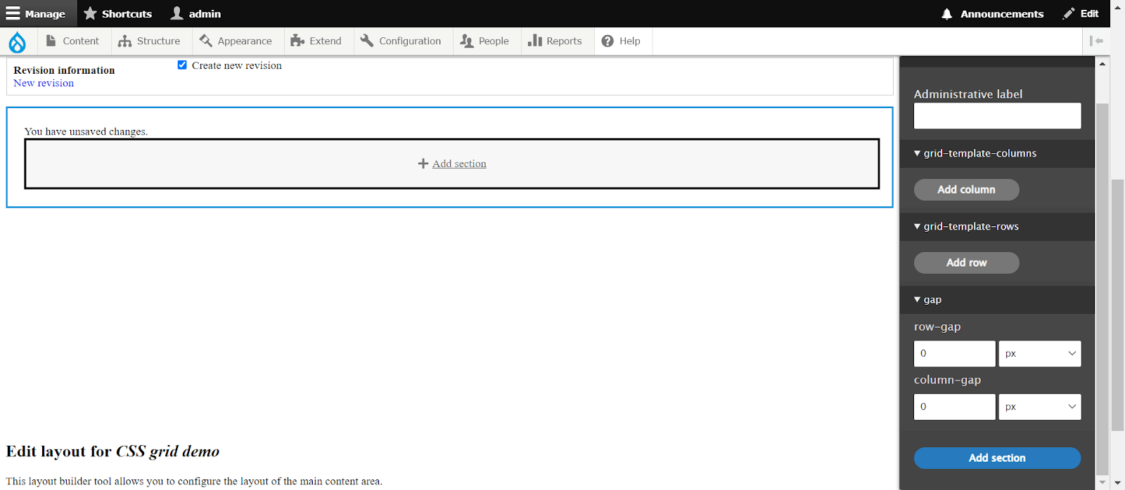
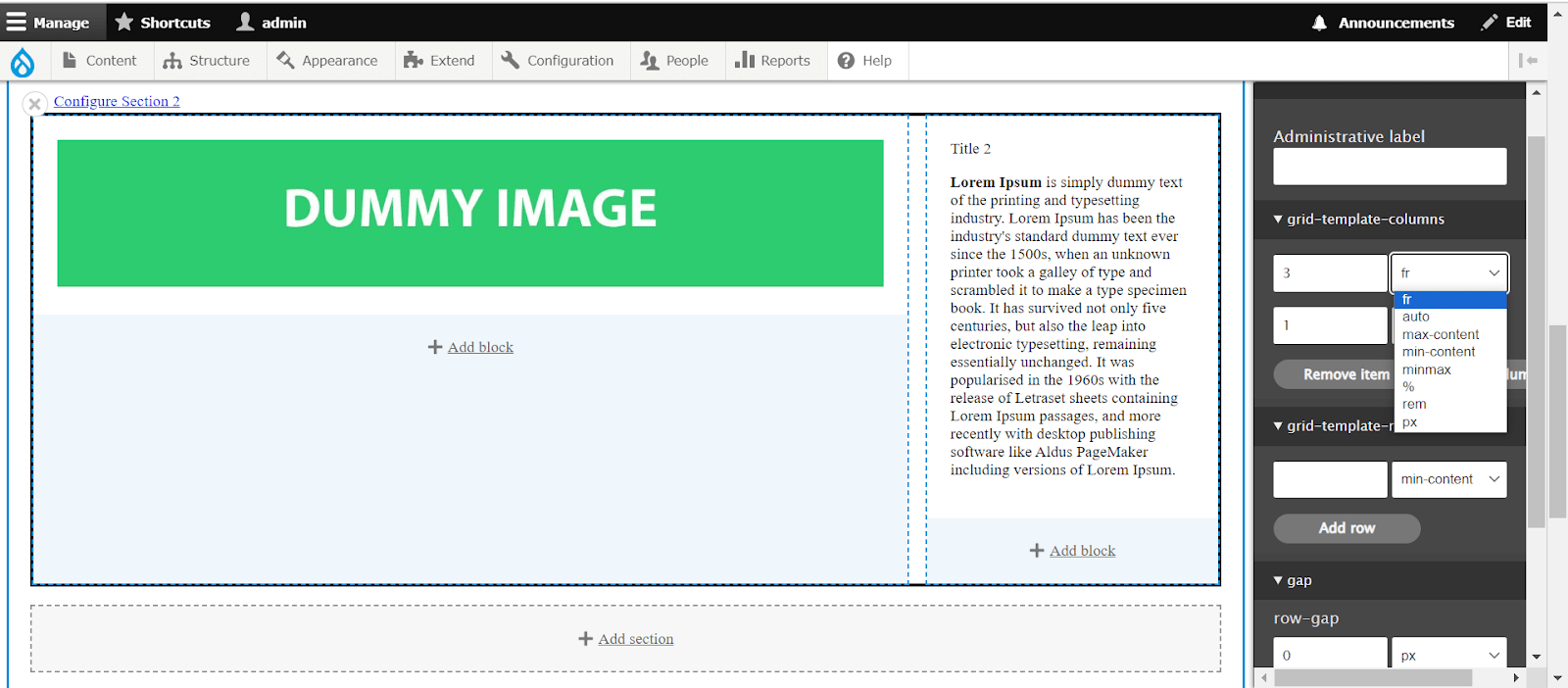
Choose CSS Grid, and you'll find options for columns, rows, and gaps, allowing you to create a dynamic grid layout.
You can then customize column, row, and gap values according to your desired structure.
You also have the option to select from different CSS and grid layout units.
Conclusion
In conclusion, the Drupal CSS Grid Layout module offers a powerful solution for enhancing page layouts within Drupal websites. By seamlessly integrating CSS Grid capabilities into the Drupal environment, it provides flexibility and efficiency in structuring and organizing content.
With the module installed and enabled, users can leverage the full potential of CSS Grid to create dynamic and responsive layouts. Utilizing features such as defining rows and columns, specifying gaps, and employing various layout units, content creators can design visually appealing and user-friendly pages.
Furthermore, the module's integration with Drupal's Layout Builder and Layout Discovery ensures a smooth and intuitive workflow for building and customizing layouts. This empowers users to create engaging and interactive web experiences tailored to their specific needs and preferences.
Overall, the Drupal CSS Grid Layout module opens up a world of possibilities for designing modern and sophisticated page layouts, making it a valuable asset for Drupal developers and site administrators alike. Whether building simple landing pages or complex multi-section layouts, this module provides the tools and flexibility needed to achieve desired design outcomes efficiently.
